The Art of Japanese Cinema Posters: Minimalism, Symbolism, and Design
Share
Japanese movie posters don’t just promote films — they interpret them.
While Western posters often go loud — layering celebrity faces, explosions, and bold titles — Japanese poster design usually takes a quieter path. With a deep respect for mood, metaphor, and negative space, it favors emotional resonance over spectacle. The result? Artwork that doesn’t just sell a film but expresses something deeper about it.
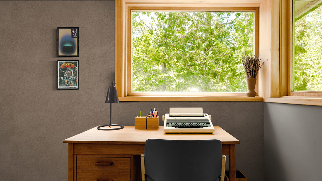
At Winnfield Co., this is why we focus exclusively on Japanese posters. We don’t see them as movie memorabilia — we see them as art pieces. Even if you’ve never seen the film, you can still connect with the aesthetic, the typography, or the mood. And in an age where AI-generated art is everywhere, there’s something powerful about hanging a rare, human-made piece on your wall.
A Different Design Philosophy
Japanese poster design embraces restraint, suggestion, and intention. You’ll often find:
- A single figure, moment, or symbol at the center
- Spacious layouts with plenty of breathing room
- Typography that feels hand-crafted or deeply integrated
- A sense of quiet — even in posters for action films or thrillers
Unlike their Western counterparts, which often aim to show you everything, Japanese posters often hint at what lies beneath the surface. They invite you to look closer.
This isn't minimalism for style's sake — it's storytelling through design.
Cultural Influences: Wabi-Sabi, Manga, and Modernism
What makes Japanese posters feel so distinct? Much of it comes from traditional visual values that shape the country’s design culture:
- Wabi-sabi: The appreciation of imperfection and impermanence, shown in asymmetry, texture, and calm compositions
- Calligraphy and kanji typography: Adds a tactile, expressive layer that feels uniquely Japanese
- Manga and anime influences: Dramatic framing, stylised faces, strong silhouettes
- Modernist design principles: Clean lines, tight spacing, and precise visual hierarchy
Combined, these elements create a visual language that’s elegant, emotional, and deeply human.
Case Study: Rambo: First Blood — East vs West
To see this contrast in action, look no further than the poster for Rambo: First Blood (1982).
The Western poster is everything you'd expect: a muscle-bound Stallone wielding an M60, American flag in the background, bold metallic text, dramatic lighting. It screams high-octane action and patriotic fury.
The Japanese chirashi, however — designed by legendary poster artist Kiroku Higaki — takes an entirely different approach. The composition is stark and intentional. The palette is limited. Rambo stands alone in the frame, weapon lowered, surrounded by deep red and black tones. The atmosphere is tense, not triumphant. Instead of shouting at you, it pulls you in.
It’s the same film, but the Japanese version speaks through mood, not volume. It tells a different story — one about isolation, trauma, and intensity, rather than action and heroism.
Why It Still Feels Modern
Despite being decades old, many Japanese posters still feel fresh. That’s because they were never chasing trends — they were guided by timeless design principles.
In today’s world, where walls are often filled with generic prints or mass-produced decor, Japanese posters offer something rare: originality. Thoughtfulness. Craft.
They’re not just fragments of pop culture — they’re standalone works of art.
Final Thoughts
Japanese film posters invite us to experience cinema through a different lens — one that values emotion over excess, symbolism over summary, and art over advertising.
At Winnfield Co., we curate these posters not just for collectors, but for anyone who appreciates great design. Whether you’re building a home gallery or just looking for something real to put on your wall, a Japanese poster offers both visual impact and artistic soul.
Explore our latest prints & posters → [New Arrivals]